
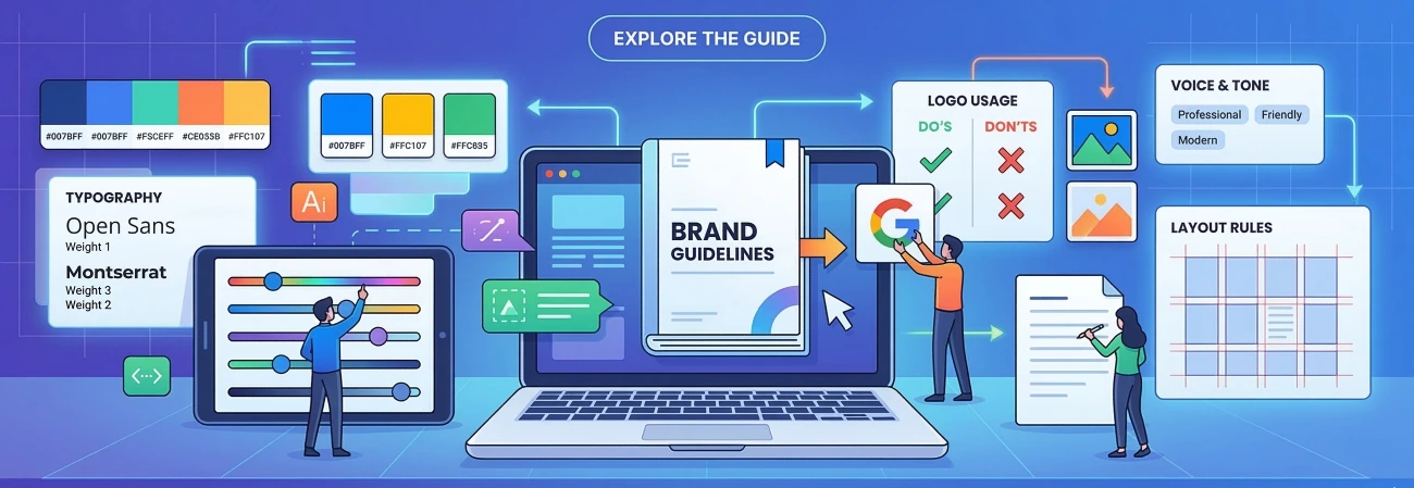
How to Write Brand Guidelines: The Complete Guide for 2026
Brand guidelines are the single most important document your business can create. They define who you are, how you look, how you speak, and how every touchpoint — from your website to your business cards — should feel. Without them, your brand becomes inconsistent, diluted, and forgettable.
This guide walks you through everything you need to create professional brand guidelines that your team, designers, and partners can actually use.
What Are Brand Guidelines?
Brand guidelines (also called a brand style guide or brand bible) are a set of rules that define how your brand presents itself to the world. They cover everything from your logo usage and colour palette to your typography, photography style, and tone of voice.
Think of them as a rulebook that ensures everyone — whether it is your internal marketing team, a freelance designer in another country, or a print vendor — produces work that looks and feels unmistakably like your brand.
Why Do You Need Brand Guidelines?
- Consistency builds trust. Research by Lucidpress found that consistent brand presentation can increase revenue by up to 33%.
- It saves time and money. Without guidelines, every designer reinvents the wheel. With them, your team moves faster and produces better work.
- It scales with you. As your team grows, guidelines ensure new hires and external partners maintain your standards.
- It protects your brand equity. A strong, consistent brand is a business asset. Guidelines protect it.
What Should Brand Guidelines Include?
A comprehensive brand guide typically covers the following sections. Not every business needs all of them — prioritise what matters most for your context.
1. Brand Story and Mission
Before you talk about colours or fonts, you need to define why your brand exists. Cover your mission statement, vision, brand values, and brand personality. This foundation informs every visual and verbal decision that follows. Do not skip it.
2. Logo Usage
Your logo section should be exhaustive. Include your primary logo, secondary variants (stacked, icon-only, wordmark-only), colour variations (full colour, reversed, monochrome), clear space rules, minimum size specifications, misuse examples, and all required file formats — SVG for digital, EPS or PDF for print, PNG for general use.
3. Colour Palette
Define your colours with precision so they reproduce consistently across every medium. Specify primary, secondary, and neutral colours with HEX, RGB, and CMYK values. Include colour usage rules and always document WCAG contrast ratios to ensure accessibility for all users.
Pro tip: Always include both HEX for digital and CMYK for print. The same visual colour looks different on screen versus printed if you do not specify the correct values for each medium.
4. Typography
Typography is one of the most powerful brand differentiators. Specify your primary typeface for headlines, your secondary typeface for body copy, a complete type scale with exact sizes for H1 through H4 plus body and captions, line height and letter spacing rules, and web versus print specifications. Always include fallback fonts.
5. Imagery and Photography
Images shape perception more powerfully than words. Define your photography style, subject matter, mood and tone, and what to avoid. Call out stock photo clichés explicitly — the handshake, the headset person, the finger pointing at a screen — so there is no ambiguity.
6. Voice and Tone
Your brand voice is consistent. Your tone adapts to context. Define three to five voice attributes that describe how you communicate, then show how the tone shifts between social media, email, and formal communications. Include side-by-side examples of on-brand versus off-brand copy. This section prevents the most common brand inconsistency: a polished visual identity paired with sloppy, inconsistent writing.
7. UI Components (for digital brands)
If you have a digital product or website, document your UI system: button styles and states, form input specifications, card and container styles, your spacing system (typically an 8px base grid), icon library guidelines, and motion principles including easing curves and transition durations.
How to Format Your Brand Guidelines
The best format is the one your team will actually use. A PDF document is great for external vendors but hard to update. A web-based portal is always current and accessible on any device — ideal for larger teams. Figma integrates directly into your design workflow. For most businesses, a combination works best: a web portal for day-to-day reference and a PDF for external partners.
Common Mistakes to Avoid
- Being too vague. Specify exact values, exact use cases, and exact approved combinations.
- Omitting misuse examples. Show explicitly what is wrong, not just what is right.
- Ignoring accessibility. WCAG contrast ratios and minimum font sizes are non-negotiable.
- Not updating them. Brand guidelines are a living document. Review them at least annually.
- Making them hard to find. A document nobody can locate is worse than no guidelines at all.
- Skipping the brand story. Visual rules without the underlying why produce technically correct but soulless executions.
How Long Should Brand Guidelines Be?
There is no rule. A lean startup might need a focused 15-page document. A global enterprise might build a 200-page system. Start lean and add sections as the need arises. A focused guide that gets used every day beats an exhaustive document that sits on a shared drive untouched.
Need Help Creating Your Brand Guidelines?
At Metrixa Digital, we create brand guidelines designed to be used — not filed away. Whether you are building your brand identity from scratch or codifying a brand that has grown organically, we deliver interactive web portals that give your team and partners instant, always-updated access from any device.
 Previous